


By Blair Jackson
Philip Cushway will not hesitate to tell you that he is not a Dead Head — not a fan of the Dead’s music, particularly. But he loves the art that the band has inspired since the mid -’60s, and he also cares deeply about the artists who created those hundreds upon hundreds of posters, album covers and free-standing art pieces.
In the late ’80s, Cushway became an art dealer himself, buying up more than a million posters and other works from collections of all sizes, and establishing his San Francisco-based ArtRock enterprise as the most successful business of its kind in the world. Cushway has also been responsible for publishing more than 500 limited edition prints, silkscreens, letterpress and photogravure posters and other works for modern bands (REM, Siouxsie & the Banshees, et al) as well as ones by old favorites since he first became intrigued by the medium in Ann Arbor, Michigan, where he lived for many years before relocating to the Bay Area in the late ’80s. The guy lives and breathes art.
Though Cushway states that he’s “no longer in the poster business,” he has turned his obsession with poster art and artists in a new direction: book publishing. Just out from Soft Skull Press (an imprint of Conterpoint Books) is Cushway’s Art of the Dead, which carries the cover tag line: “A Celebration of the Artists Behind the American Rock Poster Movement.” With just over 200 large and small reproductions of pieces relating to the Dead (and other bands, too), it offers a trip through time, using the Dead as the primary touchstone, but with more of a focus on the artists and the development of the poster as a modern art form, than on the band.
He uses interviews he and others conducted with top artists—including SF poster pioneers Stanley Mouse, Alton Kelley, Victor Moscoso, David Singer and others—to tell the story of the movement in their own words. Along the way, we learn much about the tools and techniques they employed, and their relationships with the bands, promoters and each other. Cushway doesn’t just dwell on the best-known artists, either—he is also generous in his coverage of lesser-known but still extremely talented folks such as Lee Conklin (you loved his cover for the first Santana album), Bonnie McLean (Bill Graham’s ex), Randy Tuten and Mark Arminski. And Cushway’s chronology goes all the way up to the posters Michael Everett created (and Cushway published) for the last Dead tours in 1995, so it gives a nice historical overview of the art that accompanied the group’s entire career. It’s also fun to see so many original sketches, artist’s proofs and process materials (blue lines, printing plates, film etc.) illustrating how the works evolved.
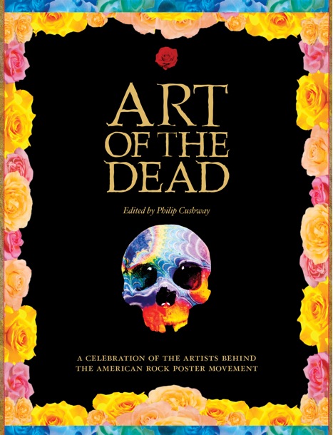
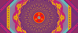
The beautiful cover image for the book was adapted from a 1995 Grateful Dead Mardi Gras poster (2/24-26) designed by Troy Alders.
Paul Grushkin’s epic tome, The Art of Rock (and it’s fabulous follow-up, The Art of Modern Rock), will always be the gold standard for books about rock posters, but Cushway’s opus is a fine, concentrated dose of eye-popping Dead-oriented “high art,” bound to please both serious and casual fans of the band.
I spoke with Cushway recently and asked him a few questions about his approach to the book.
Can you tell me a little about how you got into collecting and selling posters?
I grew up in Chicago, but I was in Ann Arbor, Michigan, for a while, knocking around trying to find something that interested me. One day I went into a bookstore and I bought a copy of Relix magazine—I had never bought it ever before—and inside there was an article about this book that was going to be coming out in a year or two, called The Art of Rock, by Paul Grushkin. That really interested me, so I flew out to San Francisco and I met Paul Grushkin and I fell in love with the posters. They’re tactile and so beautiful, and I’ve always loved music. Grushkin introduced me to Ben Friedman [who ran the famous Poster Mat store on Columbus Avenue in North Beach, SF] and I also met with John Burns [of Haight Street Graphics] and a few other people, and that got me started. Back then, most posters were still quite inexpensive.
Were you buying them mostly as an investment? Did you know it was going to turn into a business for you?
No. I just got very interested in it. But as I got into it more and more, I wanted to buy out Ben Friedman and he wanted a lot of money for his collection. I gambled everything I had to buy it and fortunately he allowed me to pay it off over a number of years; that was the only way I could afford it. But I felt strongly that this was great art, and even in my first catalogue, the designation was always the artist in bold underneath the image, not the bands. I always viewed it that way.
Where were you finding them? Were they all big collections, or did you seek out small private collections or folks who had them hanging up on their walls with thumbtack holes in them? Since in most cases it was publically distributed art, I would think the variety and quality of them would vary greatly.
That’s true. For one-off pieces, small collections are best, but when I bought out Ben, he had previously bought out Bill Graham’s [collection] and Chet Helms and the Family Dog’s; probably about a million pieces of inventory total. It took me a year just to sort it and process it.
And in that process, what do you feel you learned about the art? In the book you have nice homages to some of the influences—Japanese woodblock art and art nouveau. Once you understood that story, what did it tell you about the early San Francisco scene and the artists who populated it?
There’s a quote in the book by Kelley where he says, “The posters were real things in a real time, and a really far-out time. The posters were for dances and the dances were special.” And I think that captures the essence of the book. It started with the dances.
One thing that surprised me a little in working on this book is that Kelley came out as one of the most important figures of this whole thing. Great as he was, he was not the best artist. I think Rick [Griffin] and Stanley [Mouse] are better. But in a lot of ways, he was the most essential character in the evolution of this art.
Kelley was a really smart guy. He finished high school at 16 with straight A’s. He read a lot; we talked a lot about books. And he was also a rascal and very interested in pop culture. He was part of the original Family Dog, so he was involved with posters from the very beginning. Then in May of ’66 came Kelley’s first poster with Mouse, and they turned out to be this fantastic team, of course.
But Kelley’s the one who brought in pop cultural imagery. He bought in Winnie the Pooh, Smokey the Bear, Frankenstein. In ’65 and early ’66 there was no image bank to draw from, but he and Mouse were pulling things from all sorts of different sources. Someone like Wes Wilson was using lettering as art, but he had to do a poster each week so he’d differentiate them with his lettering and working with color. But he wasn’t really drawing images until June of ’66.
Going to the library and finding images was a Kelley and Mouse thing. The other thing that Kelley did—if you look at first printings of what Kelley and Mouse printed, they’re different. The reason why they’re different is they printed them at Bindweed Press, which had an old press in a basement that laid down a lot of ink. Kelley wanted soft paper because he loved the way the ink went on that paper, and he was right. If you look at the first printings when Kelley oversaw it, it’s really a piece of art. Second printing is a print job—still beautiful, but different.
I always say that Kelley brought in the pop cultural sensibilities, Mouse brought in that beautiful feel for the art nouveau. Wes Wilson was lettering. Moscoso was color and Rick [Griffin] for overall excellence.
One other thing about the art that I found interesting was the integration of lettering as art in an overall art piece. These artists were the foremost letterers of the last 100 years, and their seamless integration of art and image as one fused piece is one of their greatest contributions. They are the modern-day equivalent of [art nouveau and Belle Epoque poster artists] Toulouse-Lautrec, Mucha and Chéret.
The printers and lithographers were sort of the unsung heroes, weren’t they?
That’s true in several senses. In the era of the Bindweed Press, Kelley worked very directly with them. That was also true at Tea Lautrec’s [Lithoghraphy]. I knew Levon [Mosgofian, owner] and Monroe [Schwartz] and Joe Buchwald [Marty Balin’s father; he and Schwartz were lithographers at Lautrec’s]. All the printers were very quality-conscious and worked closely with the artists. They all loved to experiment and play.
Philip Cushway
I collect proof sheets and misprints and odd printings where they were playing with different colors. The thing about Tea Lautrec is they used a one-color press, and a one-color press can lay down a lot of ink. When they printed four-color, they would put the yellow up on this board first and then they’d guess how much of the other three colors to put down. When you’re doing four-color process like that, it takes a tremendous amount of skill. You can’t see it right away. In a sense you have to guess at it and hope you’re right. Also at Lautrec, they had a piece of plate glass and they would hand-mix colors on it. For example, on BG-110, the Cream poster by Mouse, that’s a hand-mixed background. They were always pushing the envelope and trying different things, just like the artists were with their images and lettering.
As a teenager seeing the posters during the late ’60s, I was always blown away by the way the artists could put colors together and they would totally pop and vibrate.
That came from Moscoso. He was into Josef Albers and his color theory. You’re not supposed to juxtapose two colors from opposite sides of the color wheel because your eye does not know which color is dominant. However, it’s more complicated than that. In the book, Moscoso talks about the necessity of getting the right intensity of value of the colors your juxtaposing with another. Moscoso may have been the most erudite of all of them. He’s quite insightful.
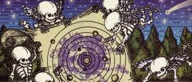
Tell me about the imagery of the Grateful Dead. Obviously there’s life and death and there are roses and skeletons and all, but also images from the natural world work so well—like if you look at the last images of the book by Michael Everett. It seems as though artists could jump off just about anything and have it make sense with the name.
That’s right. They did a couple of things that were very interesting. They were always very open to new imagery. And they didn’t shut down the parking lot stuff—they welcomed it. They would borrow from it.
The evolution of the imagery is interesting. On the first posters the Dead were usually just one band among many. And those were all done for dances. They were not really concerts where they were saying “Come see the Grateful Dead.” And you saw the posters when you went to your local store or where you went to buy milk.
As the Dead started to emerge as a more recognizable entity on their own, the artists started tailoring what they did to the name more. The first use of the skeleton was done by Wes Wilson for FD [Family Dog]12—“The Quick and the Dead”—where he took some clip-art; I think it was for a funeral ad, or something like that. Then Mouse and Kelley did their famous one [“Skeleton and Roses’], of course. For that one, Mouse and Kelley went to the library and cut the page out of the book and worked with it, and that was the image that really did it. Because it was a reflection of life and death and the fraglity and beauty of life.
The Dead never had a strict style guide of what they wanted, so you get this amazing variety of ideas from many different artists. Michael Everett got his gig by sending in decorated envelopes, in hopes of getting tickets.
Who are some of the lesser-known artists who impressed you the most?
There are so many. Mari Tepper is one. The quality of her art is amazing. Another one that blew me away was Lee Conklin. I had never seen a piece of his original art, and once I had, I called him and said, “Lee, I did not know, because the printing of your posters did not show the true quality of your work.” And even though some artists, like Rick Griffin, are very well known, I don’t think he’s gotten enough credit for some of the later things he did. He was doing some of his best work to the very end, so it was nice to get some of those never-before-seen pieces in the book.
(To order Art of the Dead, click here. For more info about the book, click here.)